(Update with the copy of version: 8.5.2DRAFT) |
m (1 révision importée) |
||
| Ligne 1 : | Ligne 1 : | ||
| − | = | + | =Reading the Graph = |
| − | |||
| − | + | The horizontal axis of the graph represents time. The graph has two vertical axes, one on the left side of the graph and one on the right. The vertical axes represent the metric values. The graph displays metric values on the two vertical axes as follows: | |
| − | * | + | * The first metric you select in the '''Metrics''' list is represented on the left vertical axis. |
| − | * | + | * Subsequent metrics you select in the '''Metrics''' list continue to be represented on the left vertical axis as long as the selected metrics have the same minimum and maximum values as the first selected metric. |
| − | * {{AnchorDiv|disabled_metrics}} | + | * {{AnchorDiv|disabled_metrics}}The first metric that you select that has different minimum and maximum values than the previously-selected metric or metrics is represented on the right vertical axis. |
| − | * | + | * After there are selected metrics represented on both vertical axes, all subsequent metric selections act as follows: |
| − | ** | + | ** If a selected metric's minimum and maximum values are the same as metrics represented on the left vertical axis, then that metric is also represented on the left axis. |
| − | ** | + | ** If a selected metric's minimum and maximum values are the same as metrics represented on the right vertical axis, then that metric is also represented on the right axis. |
| − | ** | + | ** Once you have selected metrics that establish a minimum and maximum value range for both the left and right vertical axes, any metric in the '''Metrics''' list that is not yet selected, and that has minimum and maximum values different from metrics already represented on the vertical axes, is disabled. |
| − | + | A color legend over the vertical axes indicates which metrics are represented on each axis. | |
| − | + | ===Finding Data Points in the Graph=== | |
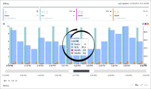
| − | + | Move your cursor into the graphing area to display the "metric needle". As you move your cursor over the graph, the needle moves also. Use the needle to find values for each graphed metric at specific points in time. | |
| − | |||
[[File:pma_ccadv-wa_metric-graphing-module_needle_852.png|center|thumb]] | [[File:pma_ccadv-wa_metric-graphing-module_needle_852.png|center|thumb]] | ||
| Ligne 22 : | Ligne 20 : | ||
{{AnchorDiv|forecast_data}} | {{AnchorDiv|forecast_data}} | ||
| − | + | ===Graphing Forecast Metrics in Workforce Advisor=== | |
| − | === | + | If you work with forecast metrics in your Workforce Advisor dashboard, and an administrator has made forecast metrics available for graphing, then you can graph forecast metrics in the Workforce Advisor '''Metric Graphing''' window in the same way that you graph any other metric. When graphing forecast metrics, the word '''Now''' displays above the dividing line between actual reported (historical) metric data and forecast (future) data. When you see the word '''Now''', any data points that display to the right of that line are forecast data points. Any data points to the left of the line represent actual reported data. The current metric value displays as the last data point before the dividing line between historical and future data. |
| − | |||
[[File:pma_ccadv-wa_metric-graphing-module_forecast-metrics_852.png|center|thumb]] | [[File:pma_ccadv-wa_metric-graphing-module_forecast-metrics_852.png|center|thumb]] | ||
[[Category:V:PMA:DRAFT]] | [[Category:V:PMA:DRAFT]] | ||
Version du juin 27, 2018 à 22:14
Reading the Graph
The horizontal axis of the graph represents time. The graph has two vertical axes, one on the left side of the graph and one on the right. The vertical axes represent the metric values. The graph displays metric values on the two vertical axes as follows:
- The first metric you select in the Metrics list is represented on the left vertical axis.
- Subsequent metrics you select in the Metrics list continue to be represented on the left vertical axis as long as the selected metrics have the same minimum and maximum values as the first selected metric.
- The first metric that you select that has different minimum and maximum values than the previously-selected metric or metrics is represented on the right vertical axis.
- After there are selected metrics represented on both vertical axes, all subsequent metric selections act as follows:
- If a selected metric's minimum and maximum values are the same as metrics represented on the left vertical axis, then that metric is also represented on the left axis.
- If a selected metric's minimum and maximum values are the same as metrics represented on the right vertical axis, then that metric is also represented on the right axis.
- Once you have selected metrics that establish a minimum and maximum value range for both the left and right vertical axes, any metric in the Metrics list that is not yet selected, and that has minimum and maximum values different from metrics already represented on the vertical axes, is disabled.
A color legend over the vertical axes indicates which metrics are represented on each axis.
Finding Data Points in the Graph
Move your cursor into the graphing area to display the "metric needle". As you move your cursor over the graph, the needle moves also. Use the needle to find values for each graphed metric at specific points in time.
Graphing Forecast Metrics in Workforce Advisor
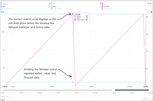
If you work with forecast metrics in your Workforce Advisor dashboard, and an administrator has made forecast metrics available for graphing, then you can graph forecast metrics in the Workforce Advisor Metric Graphing window in the same way that you graph any other metric. When graphing forecast metrics, the word Now displays above the dividing line between actual reported (historical) metric data and forecast (future) data. When you see the word Now, any data points that display to the right of that line are forecast data points. Any data points to the left of the line represent actual reported data. The current metric value displays as the last data point before the dividing line between historical and future data.


