m (1 révision importée : Milengo test upload) |
m (1 révision importée) |
||
| Ligne 1 : | Ligne 1 : | ||
| − | =Types | + | =Widget Types= |
| − | + | The widgets on the Genesys Pulse dashboard display charts that provide an at-a-glance view of what is happening in your contact center. The best way to choose a widget type is to preview the widget when you add a new widget. This allows you to see which widget type best displays what you want to see in your report. | |
| − | |||
__TOC__ | __TOC__ | ||
{{CloudStep_Stack | {{CloudStep_Stack | ||
| − | |title= | + | |title=Donut widget |
| − | |text= | + | |text=A Donut chart shows a proportional representation of the parts of a whole sample, similar to a pie chart. |
| − | + | The Donut widget displays either: | |
| − | * | + | *one statistic for four specific objects |
| − | * | + | *one statistic for three top objects and a sum of the remaining objects |
| − | * | + | *one object with the values of four defined statistics |
| − | + | Depending on the reference selected in the Cycle By option, a carousel can be defined to display additional several items. | |
| − | {{NoteFormat| | + | {{NoteFormat|If the statistic represents time, the summarized value in the center of the donut may not be useful for all statistics (for example, Oldest Call Waiting).}} |
|media1=Pulse_RTR_85105_Donut.png | |media1=Pulse_RTR_85105_Donut.png | ||
| Ligne 19 : | Ligne 18 : | ||
{{CloudStep_Stack | {{CloudStep_Stack | ||
| − | |title= | + | |title=Grid widget |
| − | |text= | + | |text=The Grid widget displays a list of items and their related statistics. |
|media1=Pulse_RTR_85105_Grid.png | |media1=Pulse_RTR_85105_Grid.png | ||
}} | }} | ||
{{CloudStep_Stack | {{CloudStep_Stack | ||
| − | |title= | + | |title=KPI widget |
| − | |text= {{NoteFormat| | + | |text= {{NoteFormat|The maximum value for the bar charts in KPI widgets is the maximum value of all the objects selected for the statistic in this widget or the maximum value of the alert configured for this widget.}} |
| − | + | ===Dashboard KPI Widget=== | |
| − | ===Widget | + | The dashboard KPI widget displays either one statistic for several objects or several statistics for one object, depending on the value of the Cycle By option. The Cycle By option is available if the widget has objects selected individually, not by group. |
| − | |||
| − | + | ===Wallboard KPI Widget=== | |
| − | ===Widget | + | The wallboard KPI widget is different from the dashboard KPI widget. The Wallboard KPI widget displays only one statistic for one selected object and is designed for large screen sizes. You can only choose only between a regular or sparkline widget. |
| − | |||
| − | + | You can enable an additional line for a statistic trend if you change the '''Format''' option to '''Line'''. | |
|media1=Pulse_RTR_85105_KPI.png | |media1=Pulse_RTR_85105_KPI.png | ||
| Ligne 42 : | Ligne 39 : | ||
{{CloudStep_Stack | {{CloudStep_Stack | ||
| − | |title= | + | |title=Line Chart |
| − | |text= | + | |text=Use the line chart to compare the trend of calls answered by each agent as points connected by lines. |
|media1=Pulse_RTR_85105_LineChart.png | |media1=Pulse_RTR_85105_LineChart.png | ||
| Ligne 49 : | Ligne 46 : | ||
{{CloudStep_Stack | {{CloudStep_Stack | ||
| − | |title= | + | |title=List widget |
| − | |text= | + | |text=The List widget displays either one statistic for many objects or many statistics for one object. Depending on the reference selected, the Headline type option might be available for this widget type. |
| − | + | The maximum value for the bar charts in List widgets is the maximum value of all the objects selected for the statistic in this widget or the maximum value of the alert configured for this widget. | |
| − | {{NoteFormat|<p> | + | {{NoteFormat|<p>Non-numeric (error) values are converted to numeric to land on a straight line between the previous and next valid values.</p><p> |
| − | + | For example, if a statistic has the historical values:</p> | |
10, 10, 10, 10, Error, Error, Error, 50, 50, Null, 10. | 10, 10, 10, 10, Error, Error, Error, 50, 50, Null, 10. | ||
| − | <p> | + | <p>The chart values may be drawn on a straight line as: </p> |
10, 10, 10, 10, 20, 30, 40, 50, 50, 30, 10. | 10, 10, 10, 10, 20, 30, 40, 50, 50, 30, 10. | ||
}} | }} | ||
Version du juin 21, 2017 à 23:48
Widget Types
The widgets on the Genesys Pulse dashboard display charts that provide an at-a-glance view of what is happening in your contact center. The best way to choose a widget type is to preview the widget when you add a new widget. This allows you to see which widget type best displays what you want to see in your report.
Sommaire
Donut widget
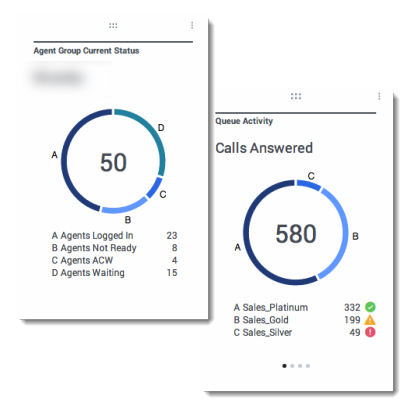
A Donut chart shows a proportional representation of the parts of a whole sample, similar to a pie chart.
The Donut widget displays either:
- one statistic for four specific objects
- one statistic for three top objects and a sum of the remaining objects
- one object with the values of four defined statistics
Depending on the reference selected in the Cycle By option, a carousel can be defined to display additional several items.
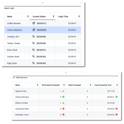
Grid widget
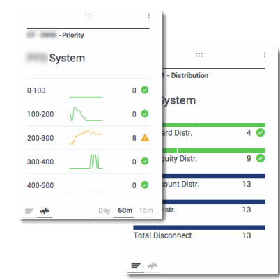
KPI widget
Dashboard KPI Widget
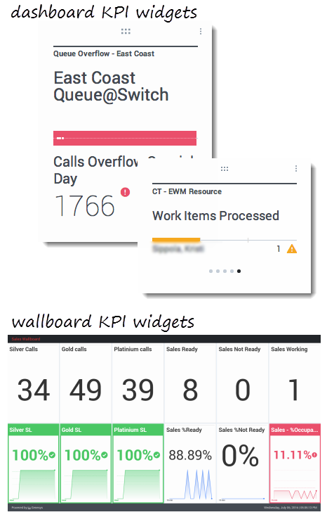
The dashboard KPI widget displays either one statistic for several objects or several statistics for one object, depending on the value of the Cycle By option. The Cycle By option is available if the widget has objects selected individually, not by group.
Wallboard KPI Widget
The wallboard KPI widget is different from the dashboard KPI widget. The Wallboard KPI widget displays only one statistic for one selected object and is designed for large screen sizes. You can only choose only between a regular or sparkline widget.
You can enable an additional line for a statistic trend if you change the Format option to Line.
Line Chart
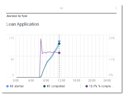
Use the line chart to compare the trend of calls answered by each agent as points connected by lines.
List widget
The List widget displays either one statistic for many objects or many statistics for one object. Depending on the reference selected, the Headline type option might be available for this widget type.
The maximum value for the bar charts in List widgets is the maximum value of all the objects selected for the statistic in this widget or the maximum value of the alert configured for this widget.
Non-numeric (error) values are converted to numeric to land on a straight line between the previous and next valid values.
For example, if a statistic has the historical values:
10, 10, 10, 10, Error, Error, Error, 50, 50, Null, 10.
The chart values may be drawn on a straight line as:
10, 10, 10, 10, 20, 30, 40, 50, 50, 30, 10.

